 |
| Namii, Jaime Cooper, red chalk on sanded pastel paper |
Showing posts with label portrait. Show all posts
Showing posts with label portrait. Show all posts
Tuesday, June 7, 2016
Finished Red Chalk Portrait of Namii
A little bit ago I posted about a demonstration at Patricia Hutton Galleries where I started a drawing. The portrait is now finished:

Friday, July 25, 2014
Colors for Underpaintings
A little bit ago I did a post on underpaintings for oils. You can use whatever color you wish. Burnt umber and raw umber are my favorites, but I will occasionally use burnt sienna, terra verte, or even purple. Awhile ago I was doing a portrait of a gorgeous lady and I wanted to capture the character of her hands. I did a study with a purple underpainting (a mix of ultramarine blue and alizarin crimson) to see if this would help me.
I decided that it actually created more work for me, so I stuck with a burnt umber underpainting for the final portrait:
 |
| Study of Hands, Jaime Cooper, copyright Jaime Cooper |
I decided that it actually created more work for me, so I stuck with a burnt umber underpainting for the final portrait:
 |
| Nurse, WWII (detail), Jaime Cooper, copyright Jaime Cooper |
Thursday, July 3, 2014
A New Portrait Sketch
This is my most recent portrait sketch. I was really attracted to the model because of her hopeful, whimsical expression, which I tried to capture here.
 |
| Hope, Jaime Cooper, 12 x 16 in., oil on linen, copyright Jaime Cooper |
Wednesday, July 2, 2014
Ligonier Art Walk
Our next Ligonier Art Walk will be Saturday November 1. The theme will be Ligonier Art Walk presents: the Affordable Art Stroll. All of the galleries around town will be open with new shows and events. I will be hosting a Student Art Show for all of my current private art students. I will again be presenting a live oil portrait painting demo during the evening. More information later. For all my students, start thinking about what you may want to submit to the art show.


Wednesday, June 11, 2014
CGI Portraits and the Uncanny Valley
Woah. CGI seems to have surpassed the uncanny valley. Chris Jones posted this on YouTube:
What does this mean for traditional hand painted art? Ultimately I don't think it means anything, other than collectors may start to value work that is obviously hand done and obviously a physical painting. In other words, I wonder if impasto and heavier paint textures will become more valued by collectors of traditional art?
Also check out this album of photorealistic CGI portrait renderings. The challenge in the future for photorealistic painters in non-digital mediums will be to make it obvious that their work is not computer generated.
Tuesday, June 10, 2014
Skin Color Limited Palette
My palette for skin colors is based on the limited palette popularized by Anders Zorn (Swedish, 1860-1920). Zorn's palette is based on four colors: ivory black, yellow ochre,
cadmium red, and white. In theory, you could achieve any color you need
with a palette consisting of white and the three primaries (blue,
yellow, and red). Zorn's palette is based on this, substituting ivory
black for blue, as ivory black has strong blue undertones.

Every time I do a portrait or figurative painting I mix the strings of color above. Looking at the larger puddles forming the strings of color they are, from left to right:
ivory black plus cadmium red, with increasing amounts of white going down = subtle purple
ivory black plus yellow ochre, with increasing amounts of white going down = subtle green
yellow ochre plus cadmium red, with increasing amounts of white going down
yellow ochre plus less cadmium red, with increasing amounts of white going down
yellow ochre with increasing amounts of white going down
I use these strings of color as the basis for all the subsequent skin colors I mix. I will occasionally grab colors outside the Zorn palette to mix in with my strings of color if I need something a little different. This is not necessary though, and I start all my students who have never worked with skin colors with just the Zorn palette. As they gain experience with color we start experimenting with other colors. I have found that students beginning with skin colors are completely overwhelmed by choice. Using a limited palette is much easier for them to control.
My full palette is the top row of paint. It is, from left to right:
ivory black, raw umber, burnt umber, ultramarine blue, cobalt violet, viridian, burnt sienna, permanent alizarin crimson, yellow ochre, cadmium orange, cadmium red, cadmium yellow, zinc white, titanium white
Every time I do a portrait or figurative painting I mix the strings of color above. Looking at the larger puddles forming the strings of color they are, from left to right:
ivory black plus cadmium red, with increasing amounts of white going down = subtle purple
ivory black plus yellow ochre, with increasing amounts of white going down = subtle green
yellow ochre plus cadmium red, with increasing amounts of white going down
yellow ochre plus less cadmium red, with increasing amounts of white going down
yellow ochre with increasing amounts of white going down
I use these strings of color as the basis for all the subsequent skin colors I mix. I will occasionally grab colors outside the Zorn palette to mix in with my strings of color if I need something a little different. This is not necessary though, and I start all my students who have never worked with skin colors with just the Zorn palette. As they gain experience with color we start experimenting with other colors. I have found that students beginning with skin colors are completely overwhelmed by choice. Using a limited palette is much easier for them to control.
My full palette is the top row of paint. It is, from left to right:
ivory black, raw umber, burnt umber, ultramarine blue, cobalt violet, viridian, burnt sienna, permanent alizarin crimson, yellow ochre, cadmium orange, cadmium red, cadmium yellow, zinc white, titanium white
Monday, June 9, 2014
Black and White Photo Reference for a Color Portrait
I teach a week long oil painting class at Common Ground every summer. This year is ancestor portraits. I am anticipating several students wanting to use black and white photo references of parents, grandparents, and even great-grandparents. I used this photo from 1902 as a reference for a painting:

and this was the oil portratit, Senex, that I did from it:
Adding color in your head when using a black and white reference really isn't difficult if you have enough experience working from live models. I can kind of see what color it should already be. It shows you that value is much more important than color, I will do a post on that later. I would have a much harder time not having a reference for the values that should be there.
If I get stuck on the color I will use a live model that I imagine to be a close match for the skin colors or another work of art as a reference. Rembrandt's portraits are a favorite for me, including this one (I feel incredibly deficient using a Rembrandt painting in the same post as one of my own paintings, but there you go):
and this was the oil portratit, Senex, that I did from it:
 |
| Senex by Jaime Cooper |
Adding color in your head when using a black and white reference really isn't difficult if you have enough experience working from live models. I can kind of see what color it should already be. It shows you that value is much more important than color, I will do a post on that later. I would have a much harder time not having a reference for the values that should be there.
If I get stuck on the color I will use a live model that I imagine to be a close match for the skin colors or another work of art as a reference. Rembrandt's portraits are a favorite for me, including this one (I feel incredibly deficient using a Rembrandt painting in the same post as one of my own paintings, but there you go):
 |
| Rembrandt Harmensz. van Rijn, An Old Man in Military Costume, The Getty Center Los Angeles |
Sunday, June 8, 2014
Common Ground on the Hill
I will be teaching a week long oil painting portrait workshop at the Common Ground on the Hill festival at McDaniel College in Westminster, MD from June 30 to July 4.
Click here for info on Common Ground.
Click here for info on my class.
Click here for info on Common Ground.
Click here for info on my class.
 |
| Land of 1755 by Jaime Cooper |
Saturday, June 7, 2014
Underpainting
Here is an underpainting for an oil portrait of a sculptor that I am currently working on. My reference is a black and white photo ca. 1900. I always do an underpainting as the first step to any oil painting.
It greatly helps me to:
1. draw the image (I don't do any drawing in pencil first)
2. decide on major structural and compositional questions
3. map out the value structure, especially placement of core shadows
I usually do them in either raw or burnt umber thinned to an ink consistency with turpenoid (and a little stand oil). Sometimes with a landscape or still life I will use burnt sienna. Every once in awhile I will go crazy and try something like purple or green. This can be an interesting take on flesh tones for a portrait. I use a brush, rag, or Q-tip to wipe out highlights. After the underpainting is finished I will start painting the color layers over it.
 |
| Underpainting for Sculptor by Jaime Cooper |
It greatly helps me to:
1. draw the image (I don't do any drawing in pencil first)
2. decide on major structural and compositional questions
3. map out the value structure, especially placement of core shadows
I usually do them in either raw or burnt umber thinned to an ink consistency with turpenoid (and a little stand oil). Sometimes with a landscape or still life I will use burnt sienna. Every once in awhile I will go crazy and try something like purple or green. This can be an interesting take on flesh tones for a portrait. I use a brush, rag, or Q-tip to wipe out highlights. After the underpainting is finished I will start painting the color layers over it.
Sunday, June 1, 2014
Robert Liberace Paints
One of my absolute favorite contemporary painters, Robert Liberace,
did an alla prima demo of a Civil War soldier at the Art League in
Alexandria, VA. This video is right up my alley as I started learning
to draw and paint with historical subjects.
Saturday, May 17, 2014
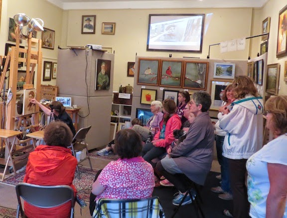
Live Demo Pictures from the Ligonier Art Walk
 |


Monday, May 12, 2014
Ligonier Art Walk Live Oil Portrait Demo
Here is a photo of my live oil portrait demo during the Ligonier Art Walk. A huge thank you to my beautiful model and the audience. It was a blast! I will post some in progress pictures of the portrait later on.

Wednesday, May 7, 2014
Live Oil Portrait Painting Demonstration
Jaime will demonstrate an oil portrait painting from a live model in her studio starting at 4 pm on Saturday May 10, 2014 during the Ligonier Art Walk. Come by to watch, ask questions, and discuss art techniques. Everyone is welcome! The studio is located at 212 West Main Street, Ligonier, PA 15658.


Subscribe to:
Posts (Atom)