Monday, June 30, 2014

Delacroix's use of Red

Yesterday I mentioned a trip to Spain a few years ago.  That got me thinking about some of the other art I had seen on that trip and I pulled out my notes.

We stayed in a hotel around the corner from the Madrid Caixa Forum.  To my delight they had a Eugene Delacroix retrospective that I didn't know about and stumbled upon.  We went in and quickly received a lesson in the Spanish culture's use of elbows to make room for yourself.  We joined in and I learned quite a bit about his techniques by being able to study his work in person once I got the hang of using my elbows.  What stood out to me the most was his use of red or burnt sienna .  He appeared to use it as an underpainting and then leave parts of it visible, especially around focal points and moving limbs.  He also juxtaposed these with touches with cool color.  This created a vibration which significantly enhanced the movement in the subjects.

Sketch of The Death of Sardanapalus, 1826-1827, Louvre Museum, (copyright Louvre Museum)
This is one of the works which was on display there.  This burnt sienna effect was especially evident in the arm of the figure in the right foreground, which unfortunately is not super obvious in this reproduction.

We are so very fortunate to live in an age where seeing this work or the other is as easy as sitting at a computer, but much is still lost by not studying the works in person.

Sunday, June 29, 2014

Reducing Detail and Aerial Perspective

One of my students is very interested in drawing architectural subjects.  We have been working for awhile now on perspective and drawing buildings.  His latest project is a graphite drawing of the Manhattan bridge and the skyline of New York behind it.  He was asking about having to draw every single window in that skyline and I was teaching him about pulling detail, that is, reducing the detail to create a greater sense of aerial perspective. 

This reminded me of two artists' work.  I saw a retrospective of Antonio Lopez Garcia's work at the Museo de Bellas Artes in Bilbao, Spain on a trip in 2011.  He is a master Madrid Realist, born in 1936.  He was an academic painter and realist even during the times several decades ago when those pursuits were heavily derided.  This is one of his paintings that was in the retrospective:

View of Madrid from Capitan Haya, 1987-94, Antonio Lopez Garcia, Museo Nacional Centro de Arte Reina Sofia
It was huge, wall sized.  You could see where he had drawn the horizon line and the holes (vanishing points) that he used to work out his perspective lines.

The second artist is Raphaella Spence.  I have been following her work for a few years and have always loved it, but have never had the opportunity to see her work in person.

New York, Raphaella Spence
Her paintings are also quite large. 

Both artists' work appears photographic when it is shrunk down in a picture, or when you are viewing it from about 20 feet.  Extraordinary work, like you are there, hovering in a helicopter.  But, when you get close to the work, something cool happens (at lease with Antonio Lopez Garcia's work, and I suspect also Raphaella Spence's work).  You realize all those details in the back are not really details at all.  They are flat planes of pastel color.  Contrasted with the painting in the foreground, they create the photorealistic look.  The foreground is painted with a large amount of detail, including in the case of Garcia's work above, mortar lines.  But it is just the crucial detail--just the right amount of detail to set up the contrast with the background.  Knowing precisely how much detail to include to create this look is the mark of a true master.

To start my students on their journey of learning this skill, I always tell them to paint only what they can see.  Do not try to add detail that you can not see.  Do not move closer to the subject to see better.  If you can't see it from where you are, it should not be included.  This is one of those skills that cannot be learned from working from photographs, you must practice from life to learn it.

Saturday, June 28, 2014

Exploration of a Sphere Part 6: There is a Point

Now I am going to bring the sphere series to a close with examples of what we have been talking about from one of my paintings:

Seneca, Jaime Cooper, courtesy Patricia Hutton Galleries


Click on any image to see a slide show.  I have picked just a few examples, there are many more in there.

Friday, June 27, 2014

Exploration of a Sphere Part 5: Painting the Sphere

Yesterday I discussed kinds of edges.  Now we will discuss how I actually painted the sphere.  I try not to torture my students (too much), so I generally let them trace a circle.  I want them to learn to control the paint, values, and edges, not be stressed about drawing a perfect circle.  It turns out that the line disappears under the paint so quickly that they wind up having to paint a perfect circle anyway, but letting them trace one takes some stress out of the start. 

In his Lives of the Artists, Vasari relates the following story:

This courtier, coming in order to see Giotto and to hear what other masters there were in Florence excellent in painting and in mosaic, talked to many masters in Siena. Then, having received drawings from them, he came to Florence, and having gone into the shop of Giotto, who was working, declared to him the mind of the Pope and in what way it was proposed to make use of his labour, and at last asked him for some little drawing, to the end that he might send it to His Holiness. Giotto, who was most courteous, took a paper, and on that, with a brush dipped in red, holding his arm fast against his side in order to make a compass, with a turn of the hand he made a circle, so true in proportion and circumference that to behold it was a marvel ... Wherefore the Pope and many courtiers that were versed in the arts recognized by this how much Giotto surpassed in excellence all the other painters of his time.

Apparently people practice perfect circles as a hobby:


Link to original video.  Pretty cool.  Anyway, back to our circle.


I first did an underpainting in raw umber thinned with turpenoid.  You can still see the underpainting in the background and the reflected light at around 5 o'clock on the sphere.  Notice how the color of the thinned raw umber leans towards a warm yellowish.  I then used raw umber mixed with zinc white to do the modeling on the sphere and a bit in the background.  Notice how the white cools the raw umber and it takes on a grayish bluish cast.  When painting I paid attention to the light, especially the core shadow and reflected light, the cast shadow, and the edges.

Thursday, June 26, 2014

Exploration of a Sphere Part 4: Kinds of Edges

Yesterday I discussed how cast shadows behave.   Today we are going to talk about edges.


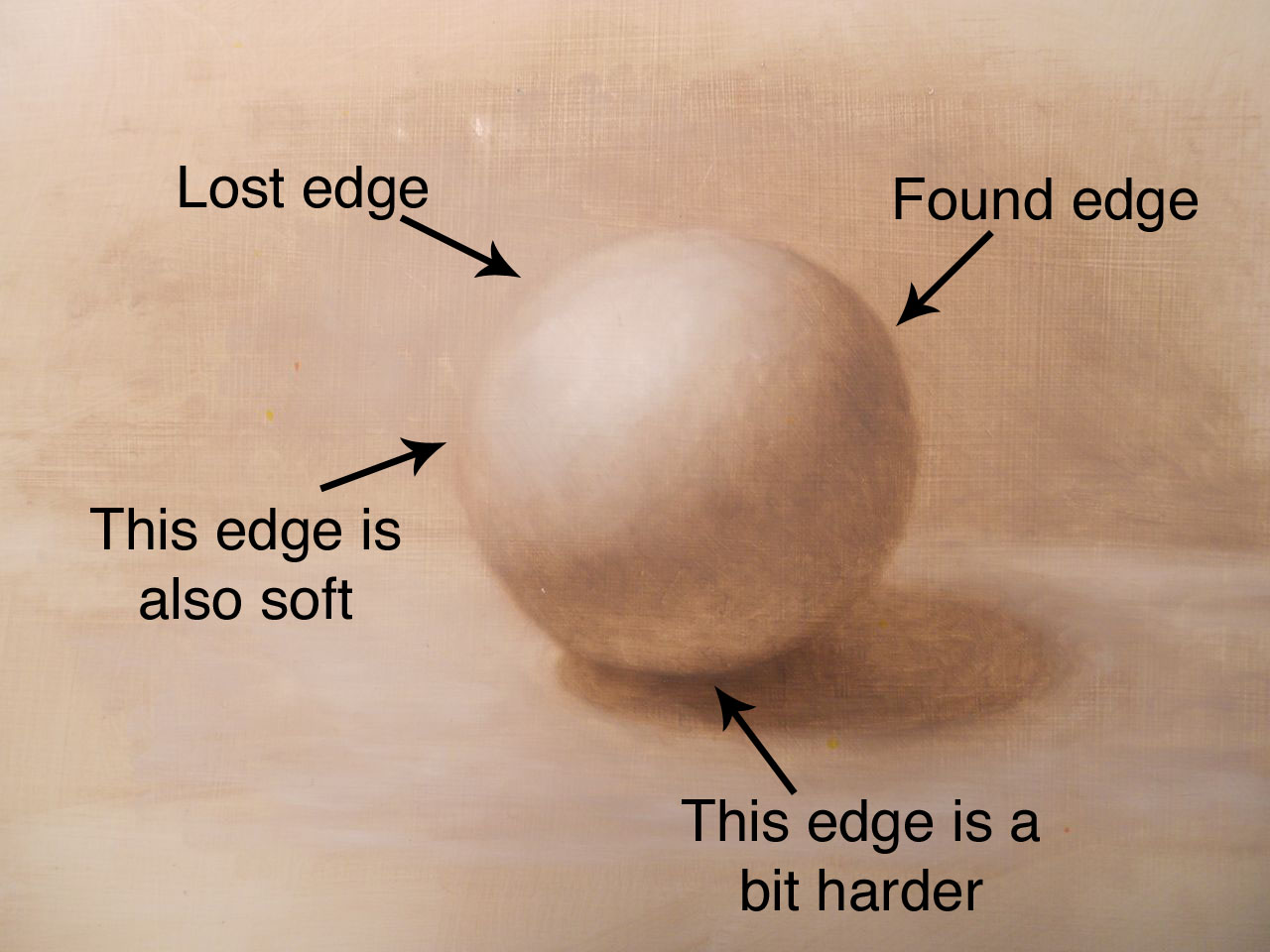
Click on the image to see a bigger view so you can really see what I am talking about.  No matter how good my shading and value structure are, my object will still look flat if I don't vary my edges.  It is the interplay between hard and soft edges, lost and found, that make an object appear three dimensional and like there is space and atmosphere surrounding it.  Edges have overlapping characteristics which I will attempt to define here.  Please ask in the comments if I don't make this clear. 

Lost edges are edges that are either so soft and fuzzy, or the object and background are so similar in color and value, or both, that you can't clearly distinguish exactly where the object stops and the background begins.  Found edges are edges where the contour of the object is so crisp, or the color and value of the background and object are so different, or both, that you can clearly see exactly where the object ends and the background begins.  You can use these properties: lost and found, and hard and soft, in conjunction with each other to control your edges.


For example, an edge can be soft (ie fuzzy) but be a different value and/or color than the background so it is a soft but found edge.  If you superimpose a clock face on the sphere you can see this at about 8 o'clock.

An edge can be soft and lost as you can see at about 11 o'clock.

An edge can be hard and found as you can see at about 6 o'clock.

Can an edge be hard and lost?  Sure.  Check out this image: 


Depending on how you tilt your screen, the rectangle may appear black, or you may be able to just see the ghost of a butterfly.  The butterfly is black, the background is just this side of black.  The edge is definitely hard, because I drew it in photoshop.  The values and color are so close that, even though the edge is hard, it is also hard to find (ie lost).

Wednesday, June 25, 2014

Exploration of a Sphere Part 3: How Cast Shadows Behave

Yesterday I discussed core shadows and reflected light.  One of my students asked a really good question about reflected light, which I answered at the bottom of the post here.  Today I am going to discuss how cast shadows behave.


Did you ever paint an object which appears to float?  That is because you haven't painted its cast shadow.  Did you ever paint an object which appears to be falling off the canvas?  That is because you have the angle of the cast shadow wrong.  (I know the sphere above is rolling down hill, but that is because I can't hold my camera straight.  I swear it is straight in real life.)  Did you ever paint an object with a cast shadow, but it still doesn't seem to be firmly planted on the surface it is sitting on?  That is because the cast shadow is not quite dark enough right up against the object.  Did you ever paint a cast shadow which appears instead to be a hole down which your object is going to fall, instead of a shadow?  That is because you got the value of the shadow too dark and too even and the edges too evenly hard.

Cast shadows are darkest right up against the object and they get slightly lighter in value as they move away from the object.  Sometimes they will have reflected light in them too.  The light comes from the main light source, hits the table, bounces back up onto the sphere and creates the reflected light on the sphere.  But look closely, sometimes the light is strong enough to continue its journey, bouncing off the sphere and back into the cast shadow.  Yikes, I know, you have to look closely.

Edges of shadows tend to be harder/sharper closer to the object casting them and get softer/fuzzier as they move away from the object.  I will talk some more about edges tomorrow.

Tuesday, June 24, 2014

Exploration of a Sphere Part 2: Core Shadows and Reflected Light

Yesterday I started my series on the simple sphere.  Today we are going to discuss core shadows and reflected light.


The core shadow is the darkest part of the object.  It is the area that misses receiving most of the light and runs just past what you would call the light side of the object.  It appears to be the darkest part because it is also not receiving any reflected light.

The reflected light is light that falls on the table and reflects or bounces back up onto the dark side of the sphere.  It creates a bit of light on the shadow side.  This light is darker than anything on the light side of our sphere.  You know when you are a kid and you hold a dandelion up under your chin to see your chin turn yellow?  That is reflected light.  The sunlight hits the dandelion and reflects off it up underneath your chin.  The next time you are out in bright sunshine look at the plane underneath everyone's chin.  If they don't get mad at you for staring at them, you should see the color of their shirt reflected up onto that plane.

Our brains are very trained to look for this reflected light in order to interpret an object as being three dimensional.  Even people who have no idea what reflected light is will look at an object painted with reflected light and say it looks more real and three dimensional that an object painted without it.  Look very hard for reflected light and get it into your shadows.  Invent it if you have to.  Remember though, it is still darker in value than anything on the light side of your object.

Monday, June 23, 2014

Exploration of a Sphere Part 1: Types of Shadow and Light

One of the most basic core doctrines of learning to paint in a representational way is to learn how light behaves and how to paint it.  Enter the good old sphere or egg.  Now art schools make students draw or paint them until the students run away screaming.  The problem is that students are never taught the point to all this boring work.  The students are just annoyed by what they think is busy work.  So I am going to do a week long series on our simple friend the sphere to attempt to explain the point.  Every object in existence that you may want to paint can be split up into combinations of spheres and planar shapes (like a cube).  It is as simple as that.  I will do a post in the near future illustrating this point.

But first, before we can combine simple objects into more complex ones, we need to understand how light behaves when it falls upon a simple object, like our good old sphere:


I set up a wood sphere on a piece of paper with a desk lamp lighting it from the side.  This is what is termed "form revealing" light.  This light creates a clear distinction between light and dark on the sphere, thus revealing its shape.  If we moved the light around so it was shining directly on and from the front of the object, it would reveal no shadows (think a picture taken with a flash).  This would flatten our sphere out so it looked like a paper cutout.  We want to make things easier on ourselves, so we want to use form revealing light.  Think chiaroscuro or Rembrandt lighting (more about this in a later post).

Rembrandt van Rijn, Self-portrait, c. 1629; Germanisches Nationalmuseum, Nuremberg

See the strong difference between light and shadow?  This is form revealing light.  Anyway, back to our sphere, which we want to also be lit with form revealing light:


Under this lighting we can see:
a highlight
the core shadow
the reflected light
and the cast shadow

The highlight is fairly obvious, it is the lightest part of the sphere, where the strongest light is directly hitting it.  More on the other kinds of light and shadow tomorrow.

***

One of my students asked:
I was reading your blog (loving it) and I have a question on the figure painted by Rembrandt.  Is there reflective light under the figure's left eye? Thanks. 

Ooo, good question!  As the reproduction above looks, the answer could be yes.  It is darker than any of the lights on the light side of the face.  However, from my experience looking at Rembrandt lighting, that triangle under the left eye should be lighter.  It is illuminated by the main light source falling on the left cheek, not light being bounced off something.  You can just see the shadow cast by the nose on the left cheek, which ends before the triangle of light begins.  I suspect that the image above is not a great picture.  Rembrandt's paintings are notoriously difficult to reproduce.  I went looking and lo and behold:

Rembrandt van Rijn, Self-portrait, c. 1629; Germanisches Nationalmuseum, Nuremberg

That is better.  So the answer is no, that triangle under his left eye is direct lighting (but reduced a bit because it is further away from the light source).  The reflected light on the left side of his face is that bluish greenish gray tinge you see along the edge of his cheek, jaw, and under his chin. 

Sunday, June 22, 2014

ReferenceReference

This is a cool website.  I was first made aware of it on James Gurney's blogReferenceReference has lots of cool video clips as reference for illustrators and animators. 

Want to know what the reflections in water look like when a tiger roars?

In what order does a camel pick up its feet when it is walking?

Saturday, June 21, 2014

Treatise on White

So many white oils paints to choose from:  lead or flake white, titanium white, zinc white, soft mixing white?  When do I use which?

I started out using titanium white oil paint when I was teaching myself to paint.  I found that I was getting lovely zombie people in my portraits.  I couldn't figure out the problem until I read one of the books in my art library which suggested flake white.  I gave it a go, and I instantly had more success.  I figured out by comparing the two that titanium is more opaque, stiffer, and more aggressive than flake white.  Through more experimentation I decided to use just flake white for all my mixing, and reserve titanium white for final highlights and impasto touches, or if I needed to add more body to a color.  I soon found that flake white was getting more expensive and harder to find, and was maybe not as archival.  So I tried zinc white and found its working properties similar enough to the flake white to make the switch.

Now I have enough experience under my belt and enough knowledge of color that I could make a painting work with just titanium white.  When I was just starting though it was much harder for me to control.  For that reason I always recommend to my students to start with zinc white, or at the very least "soft mixing" white, which is a blend of zinc and titanium white.  They all find this much easier to work with.  I then introduce titanium white into their palette for those bright impasto highlights or when more body may be needed in a specific color mix.

When buying tubes of white, I buy a couple of large tubes of zinc white at a time.  I have only ever purchased one large tube of titanium white and I am still working my way through it.  For hobbyist painters a small tube of titanium white would be sufficient.

Winsor & Newton Artists Oil Color Paint, 200ml Tube, Zinc White

Winsor & Newton Artists Oil Color Paint Tube, 37ml, Titanium White

Friday, June 20, 2014

Paper Quilling by Yulia Brodskaya

How cool is this?

and the artist, Yulia Brodskaya's website.  This one I think is my favorite:

Yulia Brodskaya paper quilling

Look at the dynamic movement she achieves.  Fantastic!  Seeing this makes me want to experiment with my favorite medium, oils, to achieve more dynamism using impasto effects.  She uses cut and bent pieces of paper and glue to produce her work.

Thursday, June 19, 2014

Masters of Human Expression

I have been listening to John Ruskin's The Two Paths.  He talks about the aim of different schools of art and I was particularly drawn to his description of the Florentine school as that is what I seek in my own work:

Well, there you have the truth of human expression proposed as an aim. That is the way people look when they feel this or that--when they have this or that other mental character: are they devotional, thoughtful, affectionate, indignant, or inspired? are they prophets, saints, priests, or kings? then--whatsoever is truly thoughtful, affectionate, prophetic, priestly, kingly--that the Florentine school tried to discern, and show; that they have discerned and shown; and all their greatness is first fastened in their aim at this central truth--the open expression of the living human soul. 
 
This made me think of a print we got when we visited the Museo del Prado in Madrid.  Antonio Gisbert was the first director of the Prado in 1868 and was part of the Spanish eclectic school of painters.  He finished El fusilamiento de Torrijos y sus compañeros en la playa de Málaga ("The Execution of Torrijos and his companions at Málaga Beach") in 1888.

Antonio Gisbert, El fusilamiento de Torrijos y sus compañeros en la playa de Málaga, Museo del Prado

When I saw this in the Prado (it is huge, it covers an entire wall) it stopped me in my tracks.  It is truly breathtaking.  Each figure is life sized I believe.  In this work Antonio Gisbert achieved a masterpiece of "the open expression of the living human soul."  Look at the painting at full resolution here and examine the varying expressions and attitudes of them all.

Here is another splendid example of human expression:

Walter Langley, Waiting for the Boats, private collection

I first saw this painting on the Art Renewal Center's website.  It is extraordinary and I was quite surprised to learn it was painted in watercolor and pencil.  I was not familiar with Walter Langley (1852-1922) before, and he is now one of my favorite artists.  His work reminds me of David Kassan's.  I was extremely fortunate to see Mr. Kassan work at a Portrait Society conference and view some of his work in person there and in New York City. 

All of them are absolute masters of human expression.

Wednesday, June 18, 2014

Book Review: Painting Sharp Focus Still Lifes

A student recently let me borrow her copy of Painting Sharp Focus Still Lifes:  Trompe L'Oeil Oil Techniques by Ken Davies (b. 1925) and Ellye Bloom.  It is a classic and very well done.  It starts with some exercises, including some useful ones one color.  It doesn't go into color theory really at all, so another book would be necessary for this.  My favorite exercise in the book is to paint a shiny white ball surrounded by different colors of fabric to practice reflected light.  The end of the book goes into demonstrations.  I thought the demo on scumbling to achieve wood textures and the small section on turning edges would be particularly helpful to my students.  Also his explanation of trompe l'oeil techniques was very well done. 


To see a modern master of trompe l'oeil, check out Anthony Waichulis' work at the John Pence Gallery.

Tuesday, June 17, 2014

My Motivation for Producing Art

I have been having a bit of a frustrating week.  The struggle to pay bills at the expense of time to do my own work, for which I don't receive immediate financial compensation, is a teeter-totter ride and I too frequently find myself having to come down on the side of paying the bills.  I am not whining (I lie, yes I am), this is the life I have chosen, but it certainly makes me question my choices.  Sometimes the lure of financial security is very strong.  I have been listening to The Two Paths by John Ruskin recently and it has been a welcome relief. 

You can get the e-text of The Two Paths on Project Gutenberg here.
You can listen to The Two Paths on Librivox.org here.

Ask yourselves what is the leading motive which actuates you while you are at work. I do not ask you what your leading motive is for working--that is a different thing; you may have families to support--parents to help--brides to win; you may have all these, or other such sacred and pre-eminent motives, to press the morning's labour and prompt the twilight thought. But when you are fairly at the work, what is the motive then which tells upon every touch of it? If it is the love of that which your work represents--if, being a landscape painter, it is love of hills and trees that moves you--if, being a figure painter, it is love of human beauty and human soul that moves you--if, being a flower or animal painter, it is love, and wonder, and delight in petal and in limb that move you, then the Spirit is upon you, and the earth is yours, and the fulness thereof. But if, on the other hand, it is petty self-complacency in your own skill, trust in precepts and laws, hope for academical or popular approbation, or avarice of wealth,--it is quite possible that by steady industry, or even by fortunate chance, you may win the applause, the position, the fortune, that you desire;-- but one touch of true art you will never lay on canvas or on stone as long as you live. 

Make, then, your choice, boldly and consciously, for one way or other it must be made. On the dark and dangerous side are set, the pride which delights in self-contemplation--the indolence which rests in unquestioned forms--the ignorance that despises what is fairest among God's creatures, and the dulness that denies what is marvellous in His working: there is a life of monotony for your own souls, and of misguiding for those of others. And, on the other side, is open to your choice the life of the crowned spirit, moving as a light in creation-- discovering always--illuminating always, gaining every hour in strength, yet bowed down every hour into deeper humility; sure of being right in its aim, sure of being irresistible in its progress; happy in what it has securely done--happier in what, day by day, it may as securely hope; happiest at the close of life, when the right hand begins to forget its cunning, to remember, that there never was a touch of the chisel or the pencil it wielded, but has added to the knowledge and quickened the happiness of mankind.
--John Ruskin, The Two Paths


Monday, June 16, 2014

Victorian, Pre-Raphaelite & British Impressionist Art Auction at Christie's

Victorian, Pre-Raphaelite & British Impressionist Art Auction at Christie's

The auction is starting June 17.  I love looking at art auctions to window shop and to get inspiration.  These are a few of my favorites from this auction:

Hercules Brabazon Brabazon, A Coastal Scene
Certainly in the running for coolest name ever is Hercules Brabazon Brabazon (1821-1906).  His A Coastal Scene drew my attention for his use of warm and cool colors.  He used one of my favorite combinations of complementary colors, yellow and purple.  I use this combination quite a bit in my own portraits.  You can see the dawn sunlight starting to break over the cool shadowed water below.

John Ruskin, A Dalmatian Pelican
John Ruskin (1819-1900) was (and is) an extremely influential English art critic of the Victorian era.  He was a prolific writer and social thinker and a big supporter of the Pre-Raphaelites.  He was involved in a scandal when his wife left him for John Everett Millais.  I was attracted to his piece for the fascination of owning something by the hand of such a huge personality.

John William Waterhouse, Day Dreams
John William Waterhouse (1849-1917) also worked in the Pre-Raphaelite syle, although he was working several decades after the Pre-Raphaelite Brotherhood.  I was attracted to this piece because of the beautiful soft color.  I find the evenly balanced blues and greens against the cream background to be very attractive and peaceful.

Frank Holl, Did You Ever Kill Anybody Father?
Frank Holl (1845-1888) is known for the pathos and story telling in his works, which is what attracted me to this piece.  You hardly need the title to figure out what is going on.  The young boy has a look of tremulous fear, curiosity, and a bit of excitement.  He is looking off the canvas with raised eyes, obviously at an adult.  He is gently holding the sword and sitting on a red cloth, which is a well known and often used symbol of blood, war, and the martial spirit.

Sunday, June 15, 2014

Why Realism? by Frederick Ross

I can't say it any better.  For all my students who have ever asked me "What is the deal with modern art?  I just don't get it."  Please read this courtesy the Art Renewal Center.

Saturday, June 14, 2014

Turtlewood Palettes

A few days ago I posted about my skin color palette.  The colors were mixed on a Turtlewood Palette, which was a birthday present and is my baby.  It is amazing to work with.  I never held a palette before getting this one as they always hurt.  This one is perfectly shaped, smoothed, counter weighted, and balanced.  It is made of some kind of very light wood and I can hold it for an hour without noticing or putting it down.  I have a Pro Series I Toned palette.  It is a snap to clean with baby wipes.  I can't say enough good things about it or the owner and palette maker Michael.  I met him several years ago at the Portrait Society Conference in Atlanta and he is an incredibly nice guy.  Highest recommendation!

Friday, June 13, 2014

Drapery Studies

I have found drapery studies to be an invaluable tool for myself and my students to understand form and of course, wrinkles.  These are from my sketchbook which I always have a hard time photographing, but hopefully you can see them well enough.  I like to drape the fabric over other objects to practice portraying the underlying form with the wrinkles.

Drapery Study 1, Jaime Cooper

Both of these studies were done in graphite.  I left the study below partially unfinished so my students can see a bit of the process.  First I block in the form and do a rough shade in to map out the values (lower left corner).  I then do another pass or layer where I start refining the shading using very sharp pencils and cross hatching (visible in the left middle of the drawing).  I then do a final pass where I further refine the shading with crosshatching (right side of the drawing).


Drapery Study 2, Jaime Cooper


Thursday, June 12, 2014

Art Glass

I love art glass.  Last summer we went to Venice, among other places, and made a lightning trip to the island of Murano where I got a piece for my birthday from Cesare Toffolo.  It is the Veronese small vase here.  I don't know much about the techniques involved in making a filigree piece like this, I actually prefer to leave it a mystery so that I maintain that sense of awe and wonder.   The picture in no way does justice to it.

I found another glass artist online, Loren Stump, who lives in California.  He did a glass murrina of Virgin of the Rocks by Leonardo DaVinci.

Virgin of the Rocks, Leonardo DaVinci, Louvre

and you can see Mr. Stumps' murrina here.  It is breathtaking when you realize how it is made.  Long colored canes (or rods) of glass are used to form the "loaf" and the image is revealed when the loaf is cut in cross section:

Madonna of the Rocks, glass murrina, Loren Stump

Wednesday, June 11, 2014

CGI Portraits and the Uncanny Valley


Woah.  CGI seems to have surpassed the uncanny valleyChris Jones posted this on YouTube:


What does this mean for traditional hand painted art?  Ultimately I don't think it means anything, other than collectors may start to value work that is obviously hand done and obviously a physical painting.  In other words, I wonder if impasto and heavier paint textures will become more valued by collectors of traditional art?

Also check out this album of photorealistic CGI portrait renderings.   The challenge in the future  for photorealistic painters in non-digital mediums will be to make it obvious that their work is not computer generated.

Tuesday, June 10, 2014

Skin Color Limited Palette

My palette for skin colors is based on the limited palette popularized by Anders Zorn (Swedish, 1860-1920).  Zorn's palette is based on four colors:  ivory black, yellow ochre, cadmium red, and white.  In theory, you could achieve any color you need with a palette consisting of white and the three primaries (blue, yellow, and red).  Zorn's palette is based on this, substituting ivory black for blue, as ivory black has strong blue undertones.


Every time I do a portrait or figurative painting I mix the strings of color above.  Looking at the larger puddles forming the strings of color they are, from left to right:
ivory black plus cadmium red, with increasing amounts of white going down = subtle purple
ivory black plus yellow ochre, with increasing amounts of white going down = subtle green
yellow ochre plus cadmium red, with increasing amounts of white going down
yellow ochre plus less cadmium red, with increasing amounts of white going down
yellow ochre with increasing amounts of white going down

I use these strings of color as the basis for all the subsequent skin colors I mix.  I will occasionally grab colors outside the Zorn palette to mix in with my strings of color if I need something a little different.  This is not necessary though, and I start all my students who have never worked with skin colors with just the Zorn palette.  As they gain experience with color we start experimenting with other colors.  I have found that students beginning with skin colors are completely overwhelmed by choice.  Using a limited palette is much easier for them to control.

My full palette is the top row of paint.  It is, from left to right:
ivory black, raw umber, burnt umber, ultramarine blue, cobalt violet, viridian, burnt sienna, permanent alizarin crimson,  yellow ochre, cadmium orange, cadmium red, cadmium yellow, zinc white, titanium white

Monday, June 9, 2014

Black and White Photo Reference for a Color Portrait

I teach a week long oil painting class at Common Ground every summer.  This year is ancestor portraits.  I am anticipating several students wanting to use black and white photo references of parents, grandparents, and even great-grandparents.   I used this photo from 1902 as a reference for a painting:


and this was the oil portratit, Senex, that I did from it:

Senex by Jaime Cooper

Adding color in your head when using a black and white reference really isn't difficult if you have enough experience working from live models.  I can kind of see what color it should already be.  It shows you that value is much more important than color, I will do a post on that later.  I would have a much harder time not having a reference for the values that should be there.

If I get stuck on the color I will use a live model that I imagine to be a close match for the skin colors or another work of art as a reference.  Rembrandt's portraits are a favorite for me, including this one (I feel incredibly deficient using a Rembrandt painting in the same post as one of my own paintings, but there you go):

 Rembrandt Harmensz. van Rijn, An Old Man in Military Costume, The Getty Center Los Angeles

Sunday, June 8, 2014

Common Ground on the Hill

I will be teaching a week long oil painting portrait workshop at the Common Ground on the Hill festival at McDaniel College in Westminster, MD from June 30 to July 4.

Click here for info on Common Ground.

Click here for info on my class.

Land of 1755 by Jaime Cooper

Saturday, June 7, 2014

Underpainting

Here is an underpainting for an oil portrait of a sculptor that I am currently working on.  My reference is a black and white photo ca. 1900.  I always do an underpainting as the first step to any oil painting.

Underpainting for Sculptor by Jaime Cooper

It greatly helps me to:
1.  draw the image (I don't do any drawing in pencil first)
2.  decide on major structural and compositional questions
3.  map out the value structure, especially placement of core shadows

I usually do them in either raw or burnt umber thinned to an ink consistency with turpenoid (and a little stand oil).  Sometimes with a landscape or still life I will use burnt sienna.  Every once in awhile I will go crazy and try something like purple or green.  This can be an interesting take on flesh tones for a portrait.  I use a brush, rag, or Q-tip to wipe out highlights.  After the underpainting is finished I will start painting the color layers over it.

Friday, June 6, 2014

Artistic Visions of Hell

One of my youngest students likes to sing while she draws and paints.  I am treated to all sorts of pop songs and occasionally classic rock.  A few weeks ago it was almost the complete score for Godspell.  She has been told that hell is a bad word, and so had to edit the songs.  This led into a rendition of AC/DCs Highway to blank (as she sang it).  When I managed to stop laughing it got me thinking about artistic representations of Hell, and the cultural history of beliefs and representations of the underworld and hell throughout humanity's history.

I went searching and found an In Our Time broadcast about the very subject.  The program gives a fascinating history of the artistic representations of hell intertwined with political and religious history.  It is a journey through the evolution of humanity's views of hell and how literature and art reflects and sometimes drives that view.

The ancient Egyptians, Hebrews, Greeks, Romans, and Chinese had a rather vague and shadowy vision of hell.  Discussions of hell in their literature are mostly morality plays and journeys of knowledge, where the hero needs to journey to the underworld to get information from souls that reside there.  Their visual references to the underworld are vague and shadowy and not very interesting for visual artists.

With the advent and spread of Christianity came striking visual representations of hell and visions of the damned in eternal suffering and torment.  Fairly early in its history Western Christianity used apocalyptic version of hell and torture.  These same kinds of visions didn't appear in Orthodox Christianity until the mid 1400s.  In the 4th century Daoists and Buddhists started competing with numerical versions of tortuous hells.

The Last Judgement, Rogier van der Weyden, Hospices de Beaune

When I was in Spain a couple years ago I saw the Garden of Earthly Delights by Heironymus Bosch in the Museo del Prado in Madrid.  The right panel of the triptych depicts damnation.  Bosch seems to have been fascinated by painting fantastical creatures and imaginings of the nastiest things that could happen to a person in hell.

The Garden of Earthly Delights, Hieronymus Bosch, Museo del Prado

I saw Michelangelo's The  Last Judgment on the Sistine Chapel altar wall in 2002.  It must have been extraordinary to view during his time lit by flickering candle light.  It was Michelangelo's attempt to put the vision of the Last Judgment of Dante's Inferno into a visual format.  It's violence and nudity shocked his contemporaries especially given the setting of the Papal chapel and its heroic scale.

Michelangelo, The Last Judgment, Sistine Chapel, Vatican

William Blake (1757-1827), a Romantic, started to turn the vision of hell into our present western view.  He could not believe that a loving God would not forgive and turned hell into a concept of the world as it is now, where it is something that we ourselves have created.  Joseph Conrad (1857-1924) used his novel Heart of Darkness to portray a journey of discovery into his own psychological vision of hell.  In the 1880s Rodin started a sculpture of The Gates of Hell, where he portrayed contemporary society as the real hell.  The thinker/Dante/Adam is looking down at the misery of the world brought about by humanity's own actions.

Rodin's The Gates of Hell, The Kunsthaus Zürich, Zurich

The In Our Time program goes into a fascinating discussion of an extremely old or prehistoric view of hell as freezing, instead of burning.  One of the guests on the program believed it was a cultural memory from 10,000 years ago from the last ice age when the environment was extremely harsh and humanity had a deep fear of the cold.  In 1922 T. S. Eliot published The Wasteland where he discussed the futility and sterility of life, uses imagery of freezing ice, and questions if there is redemption.  This leads into our current view of hell as generally being one that we make ourselves.

It is interesting to note imagery used in pop culture, for example the White Walkers in the Game of Thrones by George R.R. Martin and the Lands of Always Winter, as versions of a freezing hell.

Thursday, June 5, 2014

Simultaneous Contrast

I was teaching a student the other day and we were having a problem.  She was mixing color to use in painting an antique wood box that was a support for a still life setup.  There is a wood fired clay canister that has a beautiful yellow green glaze and several antique copper pieces in the still life.  I had her do a burnt sienna underpainting to complement the green glaze and help with the copper.  I showed her how to mix a color using yellow ochre and burnt sienna for the wood box and she got a nice warm yellow brown.  She put it on the canvas, and it was green.  Hmm...I had a suspicion we were dealing with simultaneous contrast.  But, the effect was more striking than any I had seen before, I wanted to be sure.  I had her clean the brush, same thing.  I tried another tube of yellow ochre, same thing.  I tried a different brand of yellow ochre, yet again it appeared green against the burnt sienna underpainting.  A very cool opportunity to illustrate to my student the concept of simultaneous contrast.

The original color, a mix of yellow ochre and burnt sienna, on the palette

Notice how the yellow ochre  looks green when applied over the burnt sienna underpainting

Simultaneous contrast is how two colors (or two values) next to each other can change how our brain perceives them.  Many optical illusions are based on this effect.

Click here to see some simultaneous contrast illusions based on value.
Click here to see some simultaneous contrast illusions based on color.

To overcome this problem, I had her use a mix of burnt sienna and cadmium yellow medium, which gave her the color she was looking for.  We will use the effect of the yellow ochre appearing green against the burnt sienna to good effect when it comes to painting the pottery canister.

Wednesday, June 4, 2014

Speaking of Millais' Ophelia

Yesterday I was writing about Millais' Ophelia.   Ophelia is a character from the play Hamlet by Shakespeare:

Hamlet, Act 1V, Scene V11
Laertes: Drowned! O, where?
Queen Gertrude: There is a willow grows askant the brook,
That shows his hoar leaves in the glassy stream.
Therewith fantastic garlands did she make
Of crowflowers, nettles, daisies, and long purples
That liberal shepherds give a grosser name,
But our cold maids do dead-men’s-fingers call them.
There on the pendent boughs her crownet weeds
Clambering to hang, an envious sliver broke,
When down her weedy trophies and herself
Fell in the weeping brook. Her clothes spread wide,
And mermaid-like awhile they bore her up;
Which time she chanted snatches of old tunes,
As one incapable of her own distress,
Or like a creature native and indued
Unto that element. But long it could not be
Till that her garments, heavy with their drink,
Pulled the poor wretch from her melodious lay
To muddy death.
Laertes: Alas, then she is drowned?
Queen Gertrude: Drowned, drowned

The play and the painting are both rich in symbolism.  Here is an article by the Tate Britain on the flowers and other symbolism in the painting and here is a fascinating look at the painting's history, conservation, and Millais and his techniques.

As I was analyzing the painting with my student, we were talking of the shape of the painting.  It is shaped like a tombstone and the value structure also helps to support the idea of a tomb.  Note the rich darks surrounding her head and hands and the reeds on the left providing a backstop (or tombstone) for her head.  The light flowers are overhanging her just like flowers on a grave and the sides of the stream enclose her just like a coffin.

Millais' Ophelia, Tate Britain, grayscale


Tuesday, June 3, 2014

Saturated Color

One of my students is doing a master copy of Millais' Ophelia.  She is working from an image on my computer and I desaturated it to gray scale so she could clearly see the value structure as she is working on the underpainting.  I liked the black and white version much better.  I thought the greens in the image we were painting from were too saturated.  I have never seen the original in person, so I am not sure how it compares.  We were discussing this and my student said she liked the vibrant greens.  I partially desaturated the image, and she was right!  I like the vibrant greens better too, when compared to a slightly desaturated version.  I love teaching, as I think sometimes I learn more than my students.  I think the vibrant greens make the painting a bit more arresting, and contrast with the subject matter.  Dead Ophelia surrounded by all that vibrant green life.  This is a lesson in how important color studies are.

Millais' Ophelia, Tate Britain, grayscale
Millais' Ophelia, Tate Britain, desaturated
Millais' Ophelia, Tate Britain, original